
字數:26279 字 | 預估閱讀時間:132 分鐘
20250703(四)
Github Repo:https://github.com/Waynting/photo-select-tool
小工具連結:https://waynspace.com/flow-code/
這是我用 Vibe Coding做出來的,原先對於 Html、CSS 和 JS 只知道是最基本的網頁相關語言。
但我沒想過真的有辦法以此做出這個,AI讓我能把腦海中的想法一步步實踐出來。
寫筆記除了能記錄自己學習到的內容,也是順便讓自己去讀原始碼(不然不知道怎麼維護)。
是個不錯的開始,之後看看會繼續用 AI 生成出什麼東西。
筆記內容
photo-tool/
├── index.html      # 主頁面結構
├── style.css       # 樣式定義
└── main.js         # 互動邏輯
1. index.html
功能:定義整體頁面結構,載入樣式表與腳本,並提供上傳及顯示介面。
HTML
<!DOCTYPE html>
<html lang="zh-Hant">
<head>
<meta charset="UTF-8">
<meta name="viewport" content="width=device-width, initial-scale=1.0">
<title>照片比較小工具</title>
<link rel="stylesheet" href="style.css">
</head>
<body>
<div id="photo-tool">
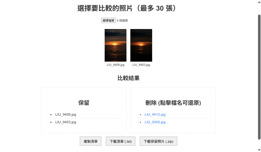
<h2>選擇要比較的照片(最多 30 張)</h2>
<input type="file" id="fileInput" multiple accept="image/*">
<div id="gallery" class="grid"></div>
<div id="resultSection" class="hidden">
<h3>比較結果</h3>
<div class="result-container">
<div class="result-column">
<h4>保留</h4>
<ul id="keptList" class="result-list"></ul>
</div>
<div class="result-column">
<h4>刪除 (點擊檔名可還原)</h4>
<ul id="deletedList" class="result-list"></ul>
</div>
</div>
<div class="result-actions">
<button id="zipBtn">下載保留照片 (.zip)</button>
</div>
</div>
</div>
<script src="https://cdnjs.cloudflare.com/ajax/libs/jszip/3.7.1/jszip.min.js"></script>
<script src="main.js"></script>
</body>
</html>1.1 <head> 區
<meta charset="UTF-8">:確保使用 UTF‑8 編碼,支援中文。<meta name="viewport" content="width=device-width, initial-scale=1.0">:響應式設計,確保在行動裝置上適當縮放。<title>:設定瀏覽器分頁標題。<link rel="stylesheet" href="style.css">:引入同目錄下的樣式檔。
1.2 <body> 結構
- 外層容器
<div id="photo-tool">:劃分此工具的專屬區域,方便後續樣式或 JS 定位。 - 標題
<h2>:顯示說明文字「選擇要比較的照片」。 - 檔案上傳
<input type="file" id="fileInput" multiple accept="image/*">:支援同時選擇多張圖片,並僅接受image/*。 - 縮圖展示區
<div id="gallery" class="grid"></div>:動態注入使用者上傳的縮圖。 - 結果區
<div id="resultSection" class="hidden">:- 初始隱藏 (
.hidden),在使用者操作後才顯示。 - 保留清單:
<ul id="keptList"> - 刪除清單:
<ul id="deletedList">,列表項具有還原功能。 - 下載按鈕:
<button id="zipBtn">,觸發 JSZip 打包下載。
- 初始隱藏 (
- 外部腳本:
- JSZip:
<script src="https://...jszip.min.js"></script> - 主程式:
<script src="main.js"></script>,處理狀態更新與事件綁定。
- JSZip:
2. style.css
功能:定義整體樣式,包含響應式布局、淺色模式強制覆蓋及各元素樣式。
2.1 通用樣式與強制淺色
CSS
/* 強制淺色背景與文字,不受外部主題覆蓋 */
body {
  background: #ffffff !important;
  color: #333333 !important;
  margin: 0;
  padding: 0;
  font-family: sans-serif;
  box-sizing: border-box;
}
#photo-tool,
#photo-tool * {
  background: #ffffff !important;
  color: #333333 !important;
}目的:隔離外部 WordPress 主題的深色/自訂樣式,確保工具始終以白底、深色文字呈現。!important:最高優先級,避免被覆蓋。box-sizing: border-box:所有元素計算含內邊距與邊框,方便控制寬高。
2.2 標題與檔案上傳按鈕
CSS
#photo-tool h2 {
  font-size: clamp(1.5rem, 4vw, 2rem);
  margin-bottom: 1rem;
}
#photo-tool #fileInput {
  display: inline-block;
  margin: 1rem 0 2rem;
}clamp():標題字體在小螢幕時最小1.5rem,大螢幕時最大2rem,中間依視窗寬度動態調整。- 調整
#fileInput的上下外距,使其在標題下方與縮圖區之間保持適當間隔。
2.3 縮圖區 (Gallery)
CSS
#photo-tool .grid {
  display: grid;
  grid-template-columns: repeat(auto-fit, minmax(120px, 1fr));
  gap: 1rem;
  margin-bottom: 2rem;
  width: 100%;
}- CSS Grid:自動填滿列數 (
auto-fit),每格最小120px、最大撐滿剩餘空間。 gap: 1rem:格子間距統一為1rem,可改為百分比或clamp()實現更靈活間距。
2.4 縮圖容器與圖片
CSS
#photo-tool .thumb {
  position: relative;
}
#photo-tool .thumb img {
  width: 100%;
  height: auto;
  aspect-ratio: 4/3;
  object-fit: cover;
  border: 2px solid transparent;
  cursor: pointer;
  transition: border-color 0.2s ease;
}
#photo-tool .thumb img:hover,
#photo-tool .thumb img.selected {
  border-color: #007bff;
}.thumb:相對定位,方便放置刪除按鈕。- 圖片使用
aspect-ratio保持 4:3 顯示比例,自動縮放,不失真。 border+transition:滑鼠懸停或選中時淡入藍色邊框。
2.5 刪除浮層按鈕
CSS
#photo-tool .delete-overlay {
  position: absolute;
  top: 0.5rem;
  right: 0.5rem;
  background: rgba(0, 0, 0, 0.6);
  color: #ffffff;
  padding: 0.25rem 0.5rem;
  border-radius: 50%;
  display: none;
  cursor: pointer;
  z-index: 10;
}
#photo-tool .thumb:hover .delete-overlay {
  display: block;
}- 絕對定位:固定在縮圖右上角。
- 初始
display: none,僅在.thumb:hover時顯示,避免畫面雜亂。
2.6 縮圖檔名
CSS
#photo-tool .filename {
  margin-top: 0.5rem;
  font-size: clamp(0.8rem, 2vw, 1rem);
  word-break: break-all;
  text-align: center;
  max-width: 150px;
}- 使用
clamp()動態文字大小,防止過大或過小。 word-break: break-all:長檔名自動斷行,避免溢出。
2.7 結果區容器
CSS
#photo-tool #resultSection {
  display: none; /* 初始隱藏,無結果時不佔空間 */
  max-width: 90%;
  margin: 2rem auto;
  background: #f9f9f9;
  border: 1px dashed #cccccc;
  padding: 1rem;
}
#photo-tool #resultSection h3 {
  font-size: clamp(1.2rem, 3vw, 1.6rem);
  margin-bottom: 1rem;
}- 初始
display: none,待renderResults()觸發時顯示。 - 邊框與背景顏色用淺灰系配色,與主畫面區分。
.8 保留/刪除欄 & 列表
CSS
#photo-tool .result-container {
  display: grid;
  grid-template-columns: repeat(auto-fit, minmax(200px, 1fr));
  gap: 1rem;
}
#photo-tool .result-column {
  background: #f9f9f9;
  padding: 1rem;
  text-align: left;
}
#photo-tool .result-column h4 {
  font-size: clamp(1rem, 2.5vw, 1.2rem);
  margin-bottom: 0.8rem;
  text-align: center;
}
#photo-tool .result-list {
  list-style: none;
  padding: 0;
  margin: 0;
}
#photo-tool .result-list li {
  padding: 0.75rem 0;
  border-bottom: 1px solid #e0e0e0;
  word-break: break-all;
}
#photo-tool .result-list li:last-child {
  border-bottom: none;
}
#photo-tool .result-list li.restoreable {
  cursor: pointer;
  color: #007bff;
}
#photo-tool .result-list li.restoreable:hover {
  text-decoration: underline;
}
- Grid 佈局:兩欄自動調整至單欄。
.result-column加 padding 與淺灰背景。- 列表項目
li有底線區隔,最後一項去除。
2.9 按鈕區
CSS
#photo-tool .result-actions {
  text-align: center;
  margin-top: 1rem;
}
#photo-tool #zipBtn {
  background: #28a745;
  color: #ffffff;
  border: none;
  border-radius: 0.3rem;
  padding: 0.75rem 1rem;
  font-size: clamp(1rem, 2.5vw, 1.2rem);
  cursor: pointer;
}- 按鈕使用
clamp()動態字體大小。 - 綠色背景白字,與其他動作區分。
2.10 響應式切換
CSS
@media (max-width: 600px) {
  #photo-tool {
    padding: 1rem;
  }
  #photo-tool .grid {
    grid-template-columns: repeat(auto-fit, minmax(100px, 1fr));
  }
  #photo-tool .filename {
    font-size: 0.8rem;
  }
  #photo-tool .result-container {
    display: block; /* 直列呈現 */
  }
  #photo-tool #zipBtn {
    width: 100%;
    box-sizing: border-box;
  }
}- 600px 以下:
- 縮圖改為最少
100px一格。 - 結果欄改為直列呈現。
- 按鈕滿寬,方便手機點擊。
- 縮圖改為最少
2.11 完整 style.css
CSS
/* 1. 強制淺色模式 */
body {
  background: #ffffff;
  color: #333333;
  margin: 0;
  padding: 0;
  font-family: sans-serif;
}
#photo-tool {
  background: #ffffff;
  color: #333333;
  padding: 2rem;
  text-align: center;
}

/* 2. 檔案上傳按鈕與標題 */
#photo-tool h2 {
  font-size: clamp(1.5rem, 4vw, 2rem);
  margin-bottom: 1rem;
}
#photo-tool #fileInput {
  margin: 1rem 0 2rem;
}

/* 3. 縮圖區:CSS Grid 自適應欄數 */
.grid {
  display: grid;
  grid-template-columns: repeat(auto-fit, minmax(120px, 1fr));
  gap: 1rem;
  margin-bottom: 2rem;
}
.thumb {
  position: relative;
}
.thumb img {
  width: 100%;
  aspect-ratio: 4/3;
  object-fit: cover;
  border: 2px solid transparent;
  cursor: pointer;
  transition: border-color 0.2s ease;
}
.thumb:hover img,
.thumb img.selected {
  border-color: #007bff;
}
.delete-overlay {
  position: absolute;
  top: 0.5rem;
  right: 0.5rem;
  background: rgba(0, 0, 0, 0.6);
  color: #fff;
  padding: 0.25rem 0.5rem;
  border-radius: 50%;
  display: none;
}
.thumb:hover .delete-overlay {
  display: block;
}
.filename {
  margin-top: 0.5rem;
  font-size: clamp(0.8rem, 2vw, 1rem);
  word-break: break-all;
  text-align: center;
}

/* 4. 結果區:自適應兩欄/單欄 */
#resultSection {
  display: none;
  max-width: 90%;
  margin: 2rem auto;
  background: #f9f9f9;
  border: 1px dashed #ccc;
  padding: 1rem;
}
.result-container {
  display: grid;
  grid-template-columns: repeat(auto-fit, minmax(200px, 1fr));
  gap: 1rem;
}
.result-column {
  background: #f9f9f9;
  padding: 1rem;
  text-align: left;
}
.result-list li {
  padding: 0.75rem 0;
  border-bottom: 1px solid #e0e0e0;
}
.result-list li.restoreable:hover {
  text-decoration: underline;
}

/* 5. 下載按鈕 */
#zipBtn {
  background: #28a745;
  color: #fff;
  border: none;
  border-radius: 0.3rem;
  padding: 0.75rem 1rem;
  font-size: clamp(1rem, 2.5vw, 1.2rem);
}

/* 6. 手機優化 */
@media (max-width: 600px) {
  #photo-tool { padding: 1rem; }
  .grid { gap: 0.5rem; }
  .filename { font-size: 0.8rem; }
  #zipBtn { width: 100%; }
}頁次: 1 2